Concept
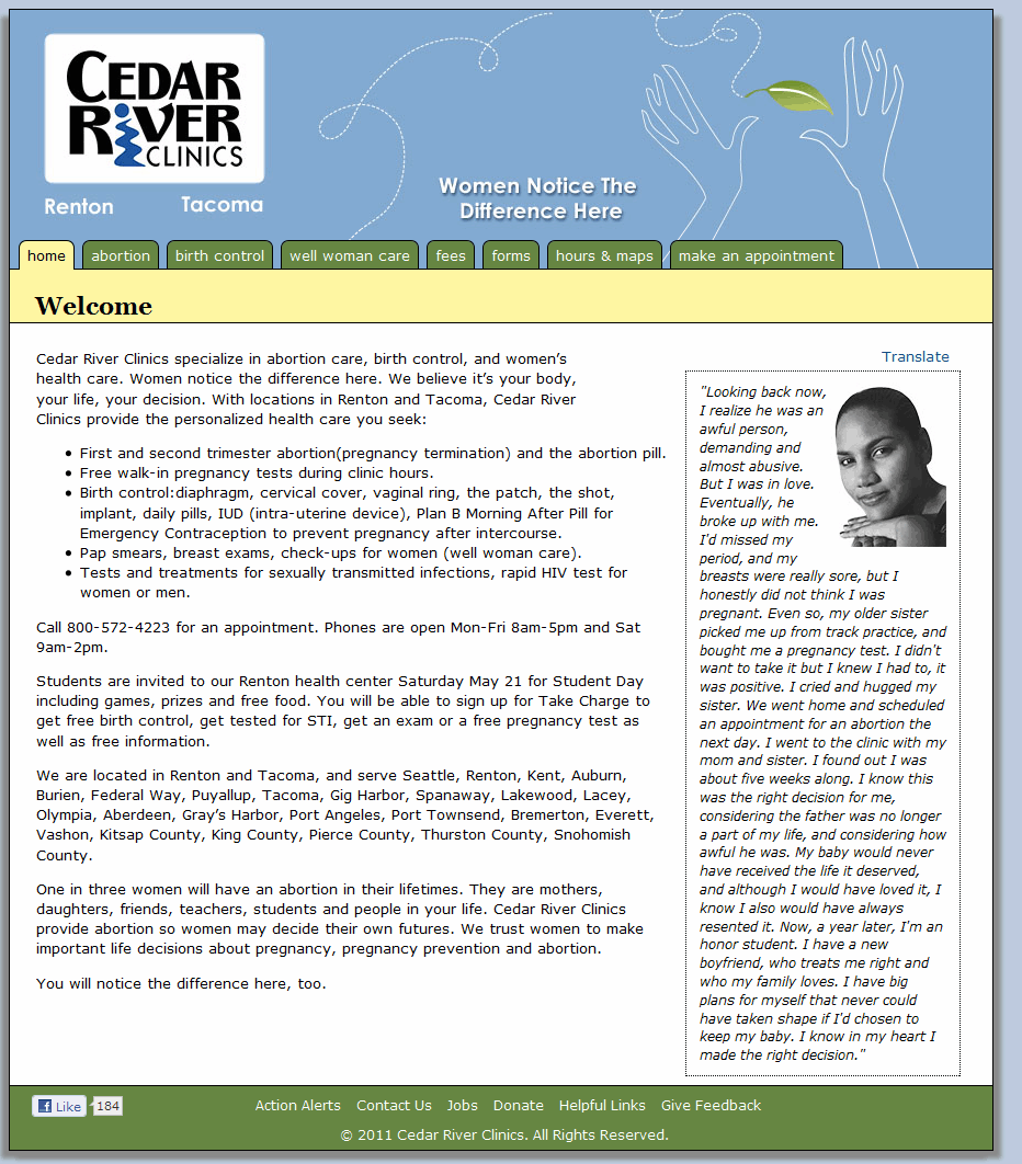
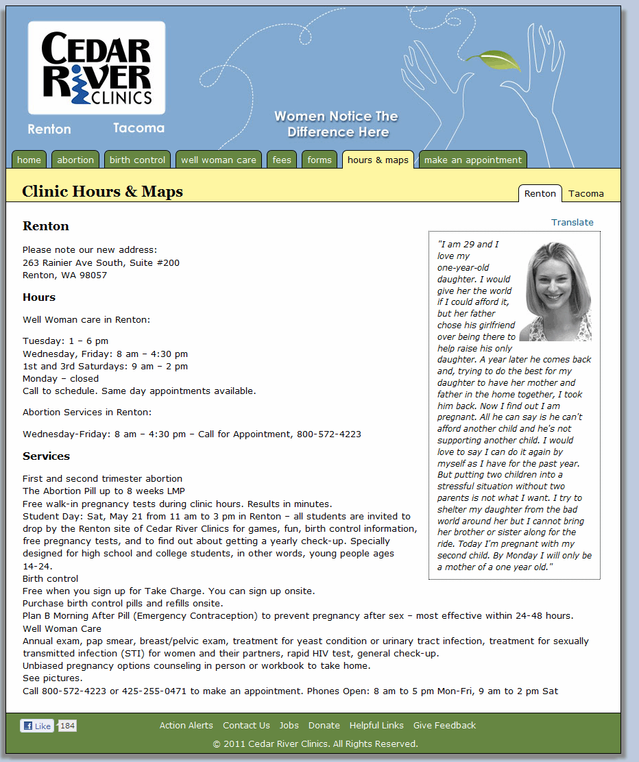
Cedar River Clinics seek to empower women to take health in their own hands, respecting their ability to make choices relating to their own health. The clinics’ website had an outdated style, with difficult-to-understand navigation and outdated HMTL templates that were hard for clinic staff to update. I worked with the director of communications to redesign the site, including an updated visual design and reorganized page content.
The goal of the new website was to make complete and accurate information clearly available, while communicating the medical professionalism of the clinic and its trust in women.
Process
I interviewed Cedar River staff about the goals, values and operations of the clinics, including patient needs. I created a survey about the existing website to find out what visitors were looking for from the site, and whether or not they were successful. I analyzed site traffic data and conducted a simple content inventory to identify ways to simplify and re-organize the site
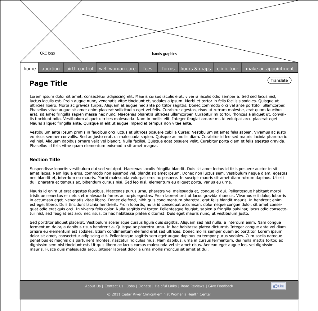
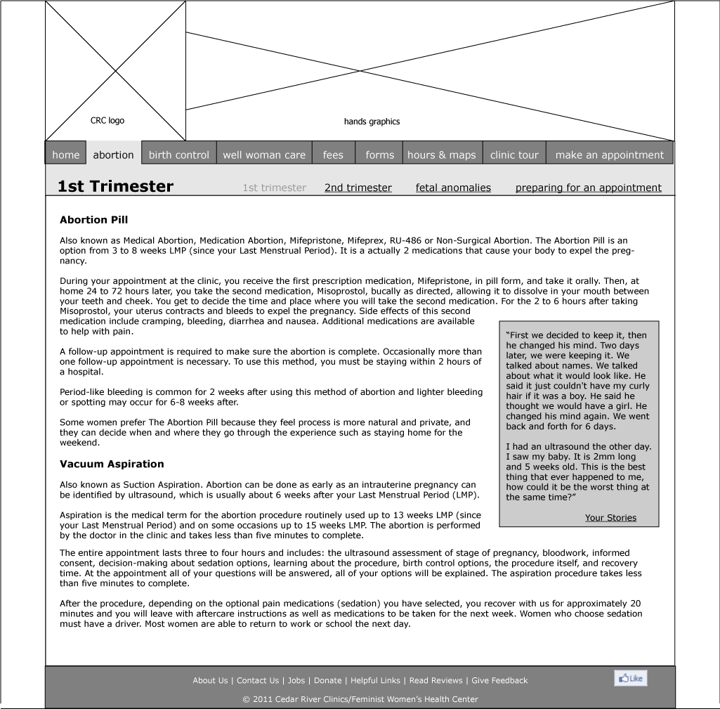
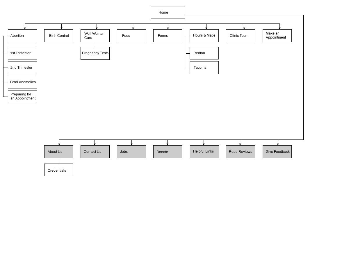
The main problem with the existing site architecture was that related information was spread across multiple pages, without a clear information scent to lead visitors to what they needed. I created a new information architecture that greatly reduced the number of individual pages, and made relationships between pages clearer. I mapped the existing pages’ content to the new architecture, and designed page layouts that presented text information simply and clearly, while reinforcing Cedar River Clinics’ core values.
We then identified Wordpress as the CMS that would best fit with the organization’s need for a relatively small, static site with a simple-to-use interface for updating and organizing content, and I developed a custom Wordpress theme based on the original wireframes.
Results
The new site launched in May 2011. Clinic staff were pleased to work with the Wordpress CMS and patient reactions were positive. Users found the new site trustworthy and simple to navigate.
