Concept
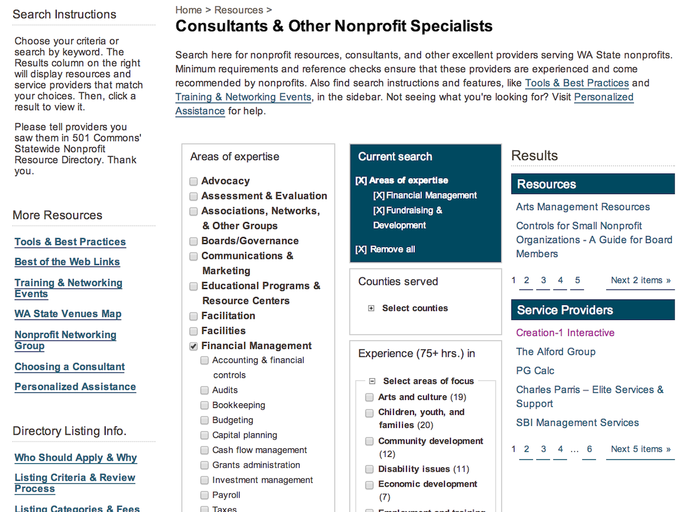
501 Commons maintains a directory of Washington State service providers who specialize in services of interest to nonprofit organizations. Members of the directory must apply, and they are vetted by 501 Commons to ensure they meet listing requirements. The existing search interface for this directory was confusing and ineffective, and a regular subject for complaints. In addition, the layout of the page had not been updated during a recent redesign, resulting in inconsistencies with the rest of the site.
I was asked to design an alternative interface for the directory that would help users find service providers matching their needs, and also showcase the value of the resources 501 Commons provides. Ultimately the page needs to demonstrate the quality of the directory to users, as well as the value to providers of being listed.
Process
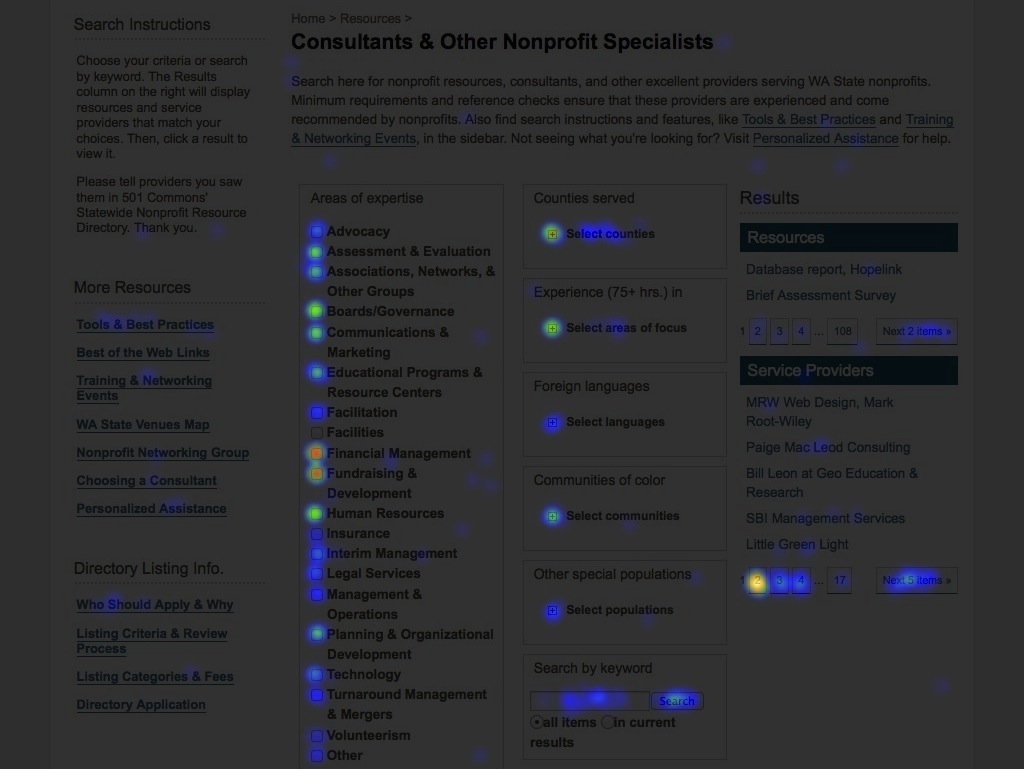
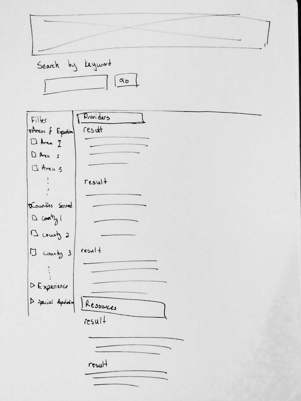
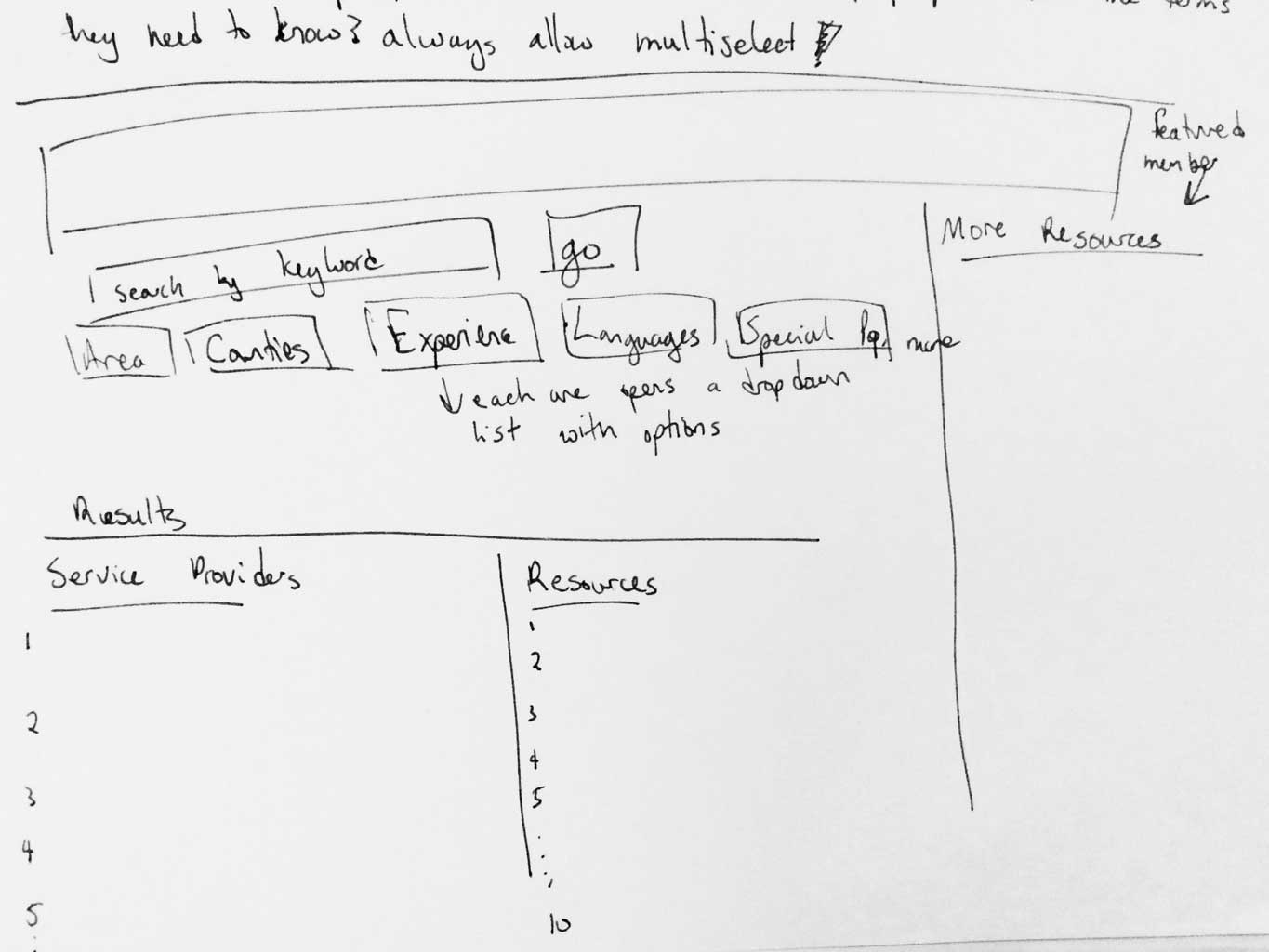
I analyzed click-tracking heat maps to understand user behavior on the existing site, focusing particularly on identifying the most-used filters and to compare search and filter use. I looked for examples of filtered searches and faceted navigation patterns to identify familiar standards. Then, combining the data analysis and stakeholders’ priorities for the page, I sketched layout ideas and began creating low-fi wireframes.
I presented several variations to the client, and moved forward with one through another round of iteration and refinement as we discussed how best to balance the organization’s goals with a user-centered perspective.
Results
The final deliverable was an interactive pdf demonstrating the primary page interactions. As of January 2014, the new design is in the process of being implemented.


